BITMAP VS VECTOR. FIGHT!
We've snapped some super close-ups of The Print Handbook. These photos are taken from the file types page where you can see for yourself why some files are better than others.
The Print Handbook has examples of JPGs, PNGs, GIFs, PSDs, TIFs, AIs and PDFs, all compared side by side. Here we're just looking at a couple. Let's start with the bitmap...
BITMAP
The photo below shows a close up of a 2MB TIFF at 300dpi. It handles the spot colour well (Pantone Orange 021) – a JPG file can't handle spot colours and would print it using CMYK. But look at those crazy wobbly lines and you can barely read the text.
VECTOR
These results are in stark contrast. This time we're looking at an 3MB Adobe Illustrator file.
Again the spot colour comes out correctly but the lines and text are so much sharper. The difference is incredible. This is why if you can create a vector file for print you should.
ROUND 2. FIGHT! [UPDATE]
Gez, in the comments, made some really good points. He put it so well I've quoted him:
"Nice article. I'd add, however, that the wobbly lines in bitmaps aren't caused by the bitmap itself, but by the antialiasing applied to the edges to make them look soft. The shades of color used to smooth the edges of type and curves get dithered by the RIP.
"If you export your bitmap without antialiasing, the edges will be sharp. At 300 dpi you'll probably see the jagged edges of the pixelated bitmap but adding more resolution the effect is mitigated. Actually, when you print vectors you're not printing vectors, but a very high resolution raster image generated from those vectors. Without antialiasing and at high resolutions (1200 or 2400 dpi), you get sharp edges without dithering, and you won't be able to see the pixelated edges."
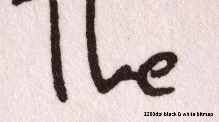
What Gez is saying is exactly right. And to prove this are the following photos (again from The Print Handbook). They are black and white bitmap files (in this case PSDs) with no antialiasing.
SO SHOULD ALL YOUR ARTWORK BE 2400DPI BITMAPS?
As you can see the last two photos in particular are pretty sharp. They produce smooth edges equivalent to those of a vector. So should all your files be 2400dpi bitmaps?
Well, no. The kind of artwork above works well with one solid ink. But if you start to include tints of that ink (like a 50% grey) you'll get similar results to the first bitmap photo. Plus, your printer is unlikely to accept a 2400dpi TIF.
WHAT SHOULD YOU DO THEN?
So, for photos (or similar artwork) stick with 300dpi bitmaps (JPGs and TIFs). For vector artwork keep it as a vector when it's sent to print (PDFs or AIs). And occasionally you may find the need to submit a 2400dpi black and white bitmap, but this will be very occasional.
Article source: https://www.printhandbook.com/blogs/news/12519205-bitmap-vs-vector-fight


